
AI Response Analysis is a feature that takes all responses from different AI models (GPT, Gemini, Yandex Alice, DeepSeek, and others) to the same prompt and automatically compares them. Instead of manually reading 4–9 different responses and looking for similarities and differences, the service does it for you in a single run and presents the results in an easy-to-understand format: cards with key metrics and five tabs with detailed insights.
This is especially useful if you are tracking:
- how different AI models talk about your brand;
- which competitors are mentioned alongside your brand;
- which sources (websites, regulators, rating agencies) AI models cite;
- whether the overall picture changes over time when the same prompt is run repeatedly.
HOW TO RUN AN ANALYSIS
- In the prompts table, the ✨ “Run analysis” icon appears in the row of the relevant prompt. It is immediately visible; there is no need to expand the row.
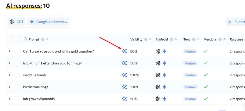
- The icon appears only when at least one model has already responded to the prompt. If there are no responses yet, the icon is not shown.
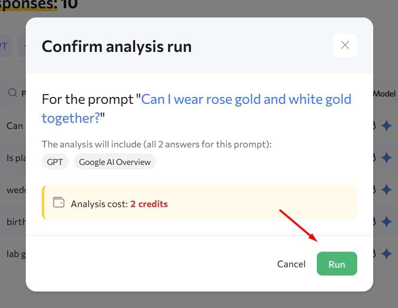
- When you click the icon, a confirmation window opens showing:
- the prompt text that will be analyzed;
- the list of models whose responses will be included in the analysis (you do not need to select them manually — all available responses are included);
- the cost of the analysis (deducted from your balance).
After confirmation, the money is deducted once and data collection begins.
ANALYSIS STATUSES IN THE TABLE
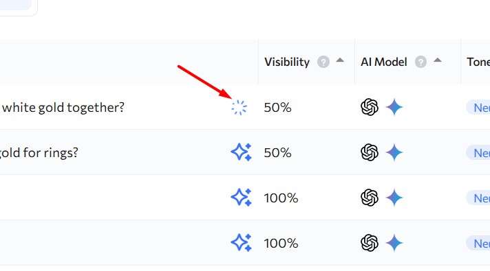
While the analysis is running, a loading indicator appears in place of the icon, with the tooltip “Analysis in progress…”. Clicking it is disabled.
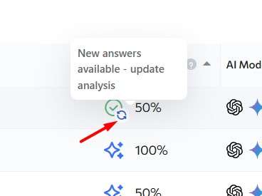
When the analysis is complete, the icon changes to a green checkmark. Clicking it immediately opens the results.
If new model responses have appeared for this prompt after the analysis was completed, a small blue refresh icon (↻) appears next to the green checkmark, with the tooltip “New responses available — update analysis”. This is a separate button: clicking the checkmark still opens the old, already calculated result, while clicking the refresh icon starts a new analysis that includes all current responses (this is a separate paid run and a new calculation). The old result is not deleted — it remains in the history and is visible in the Dynamics tab.
WHAT YOU WILL SEE IN THE RESULTS
When you open a completed analysis, you will see a window titled “AI Response Analysis”. Below the title, you will see the prompt text itself and the number of models that participated in the analysis.
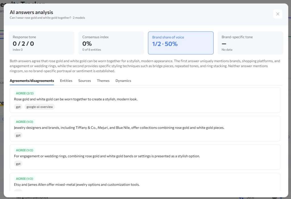
Four key metric cards
1. Response tone — shows how many responses are positive / neutral / negative (for example, “1 / 3 / 0”), along with an overall sentiment index ranging from -100 to +100.
2. Consensus index — shows the percentage of all mentioned entities (companies, brands, sources) that were confirmed by at least two different models, rather than being mentioned by only one. The higher the percentage, the more the models “agree” on the facts. If very few entities were mentioned, the card shows “insufficient data” instead of a percentage.
3. Brand share of voice — if you have specified your brand, this shows how many responses mentioned it and what percentage that represents. If your brand is itself the subject of the query (for example, the prompt “What are people saying about [your brand]?”), the card appears muted. This is expected because the result will almost always be 100%. However, if your brand is mentioned in a prompt about something else (for example, “best tools for…”), the card is highlighted — this is where the metric is actually informative, because it shows how often AI models bring up your brand in a context where it might not have been mentioned at all.
4. Brand-specific tone — a separate sentiment index calculated only from responses where your brand was actually mentioned (so the number of responses may be lower than the total number of responses). If your brand was not mentioned at all, the card shows “no data” instead of a number. Below the cards, there is a short textual summary (2–4 sentences) that explains in plain language where the models agreed, what unique information was found by only one model, and how the brand is generally being mentioned.
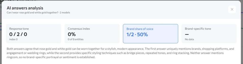
Five tabs with details
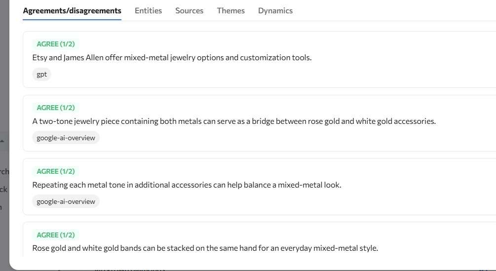
Agreements/disagreements
This tab is open by default.
It contains a list of statements (claims) that the models made about the topic of the prompt. Each claim has a colored badge:
- Green “AGREE (x/N)” — at least half of the models agree with the claim.
- Blue “AGREE (x/N)” — two or more models agree, but this is less than half of them.
- Yellow “DISAGREE” — the claim was mentioned by only one model. This is often where the most specific information can be found — a figure, award, ranking, or other detail noticed by only one AI model.
Under each claim, colored model labels show which models confirmed it. The list is sorted from the most widely confirmed claim to the most unique one. If there are many claims, the section simply becomes scrollable — nothing is hidden or truncated.
Entities
All companies, brands, regulators, and other organizations mentioned in the responses are displayed as horizontal bars — the more models that mentioned an entity, the longer the bar.
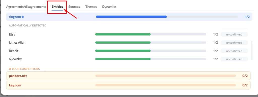
Your brand is always pinned at the top (with a ★), if it has been specified.
Below it is the “★ Your competitors” section. It includes all companies that you have manually identified as competitors, even if none of the models mentioned them. In that case, the bar is empty (0/N). This is intentional: it allows you to see not only what the models said, but also what they did not mention.
After that come all other automatically detected entities, marked as “confirmed” (mentioned by at least two models) or “not confirmed” (mentioned by only one).
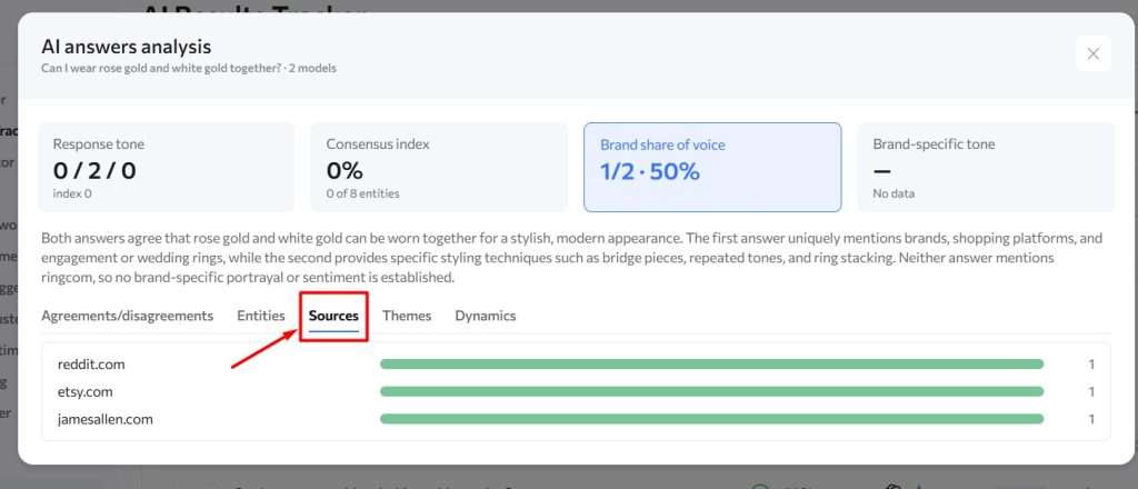
Sources
A list of domains (websites) that the models cited in their responses, sorted by the number of different models that cited each domain.
Themes
A tag cloud showing the key topics/aspects covered in the responses. The font size of each tag is proportional to the number of models that discussed it.
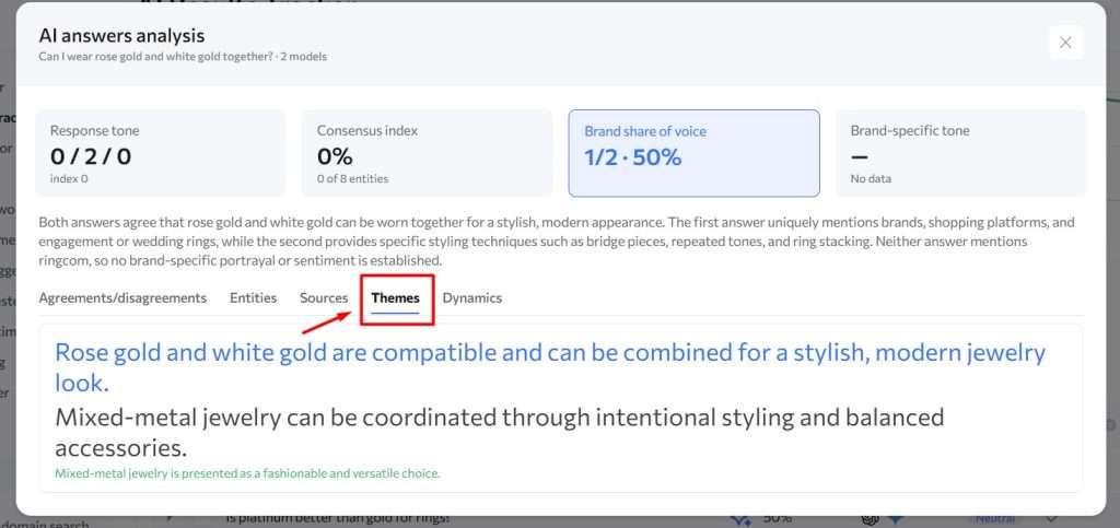
No more than the 20 most significant themes are shown.
Dynamics
A line chart showing how the key metrics — consensus index, brand-specific tone, and brand share of voice — changed across repeated analysis runs for the same prompt. In other words, it shows how the overall picture changes over time.
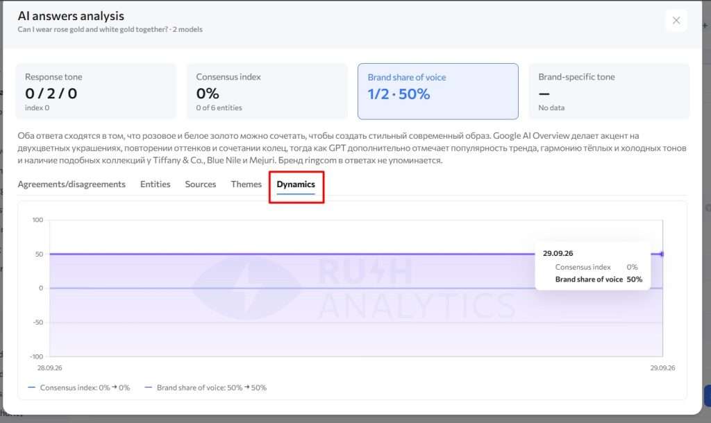
Below the chart, a short legend summarizes the change between the first and most recent values.
On the very first run, the chart is not displayed yet because there is nothing to compare against. Instead, the message “Dynamics will appear after subsequent runs” is shown.