Structure of a webpage
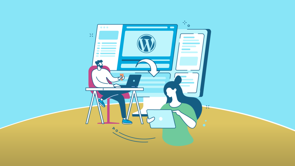
There are some website elements that are so essential to web design that all websites must contain them in order to work properly. Together, these parts form the structure of the webpage, something like the foundation of your own website itself.
Header
The header is at the top of the webpage. It is usually the first thing visitors see when they visit the website, so it should be designed as clearly as possible. It is often simple, and the content should be written in a clear and readable font. The header usually appears on all sub-pages and has the same design on each of them.
Menu
A menu is a site map that helps visitors find what they are looking for, whether it’s an online shop for your products or some information about your company. There are different types of menus on a webpage, with the most common ones shown in the header. In general, the menu contains the most important sub-pages, such as the ‘Who we are’ page, the contact page and the main elements, such as the shop and the various blog pages.
To really make it easy to navigate your site through the menu, you should structure it logically and intuitively and think carefully about which subpages you want navigation menus to display. In short, including the right categories in the header menu is essential to help visitors find the most important pages, and ultimately, you can make the difference between a successful website and one that doesn’t have the desired results.
Body
In the body of a webpage, what is known as the main content will be the main content of the web. The body of webpage can be structured in one or more columns. How this suits us best depends on our content. Sometimes we see the body divided into two columns. One takes up most of the width, about 3/4 of the parts, where the most relevant content will go. And another takes up the rest of the width, about 1/4 of the part. This part is called the sidebar. In this area we find places for advertising, social media… This type of column spread is very common in blogs.
Footer
Simply put, the footer is located at the bottom of the website. It usually contains a site map to help visitors find what they’re looking for. It’s an ideal place to link to important content that doesn’t belong in the header or main content, as well as basic contact and social media information. In the footer you can also include a subscription bar to your newsletter, a return policy for your online shop or frequently asked questions.

Parts of a webpage according to its content
Products and services
The main content of a website usually focuses on the form of a catalogue of goods classified by categories, families etc., and sometimes has an online shop that allows us to purchase goods in the moment. Like services, which are usually categorised, which makes it easier for the potential customer to understand in order to direct their attention to the section they are most interested in.
Images
While content is very important, what really catches visitors’ attention is the shocking images you choose. These are usually the first thing a user sees after the headline, so they are essential for creating a good first impression. In particular, the first image is the one that makes the difference between success (i.e. the user staying on your site) and failure (the user leaving your site).
The feature image, along with the header and menu, make up what is commonly known as the ‘above the fold’, which is the section of the website that is visible to users at first glance without the need to scroll. With this in mind, the images you choose should represent what your business or brand does, whether it’s your products or services, or simply images that represent your essence, look for those that really relate to you.
Logo
If you want to build a brand, a logo is an important part of your brand effort. Your brand logo helps to represent your company and makes it recognisable and memorable to both existing and potential customers. Usually, logos on a webpage are in the header, either in the top left corner or in the centre, and are linked to the homepage.
If you already have a logo, add it to the header and make sure it’s linked to your blog page or homepage. If you want to create a logo, you can use a logo creator such as Wix to design your own logo. We share with you this complete guide on how to make a logo.
Call To Action – (CTA)
If you are a web designer and are building a website, you probably want to get results with it, such as selling products, promoting your services or attracting visibility to your portfolio. Regardless of the goal, you need to intuit your visitors to get them to the right place, and that’s what CTAs are for. A CTA is short text that is worded as a call to action and aims to encourage visitors to take the next step towards conversion.
CTAs or calls to action can be placed on a button or as a direct link to your text. They should always be short, have an imperative verb and, even better, include some sense of urgency such as ‘buy now’. Place your calls to action prominently in several relevant places on your website, such as next to the product description or directly in the header of your own website content. Follow these tips to improve your CTA, and you’ll see your website start to bear fruit.
Forms
It is not necessary to integrate an online form on your website. Online forms are usually used to collect information. But they can also be used for other purposes, such as a contact form that allows visitors to communicate with you directly from your website.
Generally speaking, a form may be too aggressive for a homepage, but it can be great on a contact page. Depending on the type of website you can add a contact form, registration form or payment form to the landing page of your website.
Blog
A blog is essentially a collection of articles and publications that relate to your business. Marketers are increasingly using this tool in their email marketing and SEO strategies. A blog can be created as a standalone website or linked as a sub-page on the navigation bar of landing pages.
Although it is an optional element of a webpage, creating a blog is a great way to share detailed information with your target audience. Many customers appreciate this extra content, and a blog can have a positive impact on your brand image. In addition, with each blog post additional pages are indexed under your domain, which in turn can optimise your search engine ranking (SEO) and attract more traffic.
If you don’t know how to start a blog, we share this guide on how to create a blog step by step.
Contact
One of the purposes a company website usually has is to attract new customers, so it is important that a user who visits our website is able to contact us easily. To do this, we can offer custom buttons and links on our website that will take you to our contact page. The contact page should contain a simple form where the user fills in only the necessary and essential fields. The user fills in more fields than usual, this may mean that the user chooses not to fill in the form. We also often find a map showing the location of our company
Privacy policy
A resource which provides application forms, callback buttons, cookies, personal account registration, email lists and other ways of collecting, storing and processing personal data (names, phone numbers, web address, etc.) must comply with a privacy policy.
The privacy policy itself commits the owners of the resource not to transfer information about users to third parties, explains what data the resource will collect and for what purposes.

Planning a simple webpage
Once you have planned the content of a simple webpage, the next logical step is to try to determine the content you want to put on the whole website, the pages you want and how they should be organised and linked to each other for the best user experience. This is called information architecture. A large, complex website can use a lot of planning in this process, but for a simple website of a few pages it can be quite simple and fun!
- Bear in mind that you will have some elements common to most pages (if not all), such as a navigation menu and footer. For example, if your site is for a company, it is recommended to have contact information in the footer of each page. Write down what you want to have in common on each page.
- Then draw a sketch of what each page structure would look like (this could look like our simple website above). Note what each block would look like.
- Now brainstorm all the other content (that is not common to all pages) that you want to have on your site – write a big list.
- Then try to sort all these content elements into groups to give you an idea of the pieces that can fit together on different pages. This is very similar to a technique called card sorting.
- Now try drawing a rough sitemap – circle each page of your site and draw arrows to show the typical workflows between pages. The home page will probably be in the centre and linked to most, if not all, of the others; most pages of a small site should be accessible from the main navigation, although there are exceptions. You can also add notes to the presentation of things.

Conclusion
As a rule, when we talk about parts of a website, we are referring to the web structure, that is, the header, the body and the footer.
It is also not strange to talk about parts of a website to refer to the different pages that exist on the website. This is why we’ve also seen what each of these pages consists of, and the most common elements that make them up.

